
Overview of textile paint ranges and benefits
What defines a textile paint range
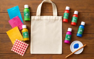
A bold fabric paint range is the quiet engine behind every bold motif. Across South Africa’s sunlit studios—from Cape Town to Joburg—color is trusted to endure heat, sun, and countless washes. The right range makes lines sharper, colors deeper, and textures livelier, turning simple garments into storytelling canvases.
What defines a textile paint range? It hinges on binder chemistry, pigment load, and fabric compatibility. A good range balances adhesion with flexibility, offers opacity on dark fabrics, and cleans up easily in a busy studio. In practice, this means smoother application, fewer cracks, and longer lifespans for designs.
- Binder system and heat-set requirements
- Wash-fastness and color retention
- Compatibility across cotton, linen, and synthetic blends
By choosing thoughtfully, designers preserve the fabric’s feel—no chalky stiffness, just vibrant, durable color that tells the story long after the first wear.
Key components and binder chemistry
Bold color begins as a whisper in the studio before it becomes a statement on fabric. A well-curated fabric paint range is the quiet engine behind every lasting motif. In South Africa’s sunlit spaces, designers watch hues resist heat and countless washes, and the lines stay crisp!
At the heart of these ranges lies binder chemistry—resin matrices that cure into flexible, durable films. Acrylic emulsions with tuned crosslinking deliver strength without stiffening the hand, while pigment dispersion keeps hue even and vibrant. The best blends pair well with cotton, linen, and blends, offering predictable results from screen to stitch.
All told, the right range translates into faithful colour, clean edges, and a hand that still feels like fabric, not paint. It’s the difference between a motif that shines in the showroom and one that endures in real-world wear.
Common finishes and textures
Across SA studios, colorfastness after 30 washes is non-negotiable, and a well-tuned fabric paint range delivers that resilience without stiffening the hand. The best blends translate a designer’s vision into durable, breathable films that flex with fabric and endure wear. It’s the quiet engine behind motifs that stay crisp from the showroom to the washing line!
Common finishes and textures shape the final look:
- Matte: velvety, non-reflective edges for clean lines.
- Satin: gentle sheen with a flexible hand.
- Gloss: crisp color with a glassy finish.
- Metallic: subtle shimmer for accents.
Texture choices influence drape, comfort, and wash durability as surely as color.
How to read fabric paint labels
Across South Africa, a fabric paint range is more than pigment—it’s a toolkit that unlocks durable, flexible color for every garment!
The best ranges offer a spectrum from sheer to opaque, with water-based binders that wash clean without harsh residues. You’ll find options calibrated for cotton, blends, or performance fabrics, each delivering color that behaves under heat and wear and never stiffs the hand.
- Carefully crafted labels show care symbols and wash cycles: maximum temperature, gentle machine wash
- Heat-setting instructions: preferred iron or heat press settings and duration
- Fabric compatibility: base fabrics and any pretreatment needed
- Safety notes: VOCs, irritants, ventilation requirements
Reading fabric paint labels is a quiet ritual that saves time and keeps work vibrant.
With a sharper eye for labels, you map the journey from design to a fabric paint range that lasts.
Safety, care, and storage considerations
Color that lasts isn’t cosmetic fluff—it’s a badge of honour for any garment. In South Africa’s DIY scene, 63% of makers say their prints survive more than 20 washes, proof that a quality fabric paint range can turn a hobby into a habit.
The best textile paint ranges span from sheer to opaque, with water-based binders that stay soft to the touch and resist cracking. Calibrated for cotton, blends, or performance fabrics, they deliver color that behaves under heat and wear—never stiff.
Safety, care, and storage considerations sit at the top of labels and playlists alike. Look for low VOCs, notes about irritants, ventilation guidance, and base fabric compatibility to keep projects shimmering rather than shrinking into a memory.
- VOC exposure and ventilation considerations
- Label checks for compatibility and curing recommendations
- Store in a cool, dry place away from heat and direct sunlight
Types within a textile paint collection
Acrylic-based textile paints
Color speaks louder on fabric than on screen, and in South Africa acrylic-based textile paints answer the call. A quick industry pulse reveals that 4 in 5 studios see faster, more reliable results when they lean into a thoughtful fabric paint range. This isn’t magic—just a spectrum designed for fiber, fade resistance, and a bit of swagger.
Within the acrylic-based textile paints, you’ll meet personalities that can be dialed from subtle to bold. Here are the core types you’ll encounter in our fabric paint range:
- Opaque acrylics for solid, blocky statements
- Transparent glazes for layered depth on busy fabrics
- Metallics and iridescents for shimmer and street-cred
- Neon and fluorescent shades for high-visibility effects
- Matte and satin finishes for texture without glare
Each type interacts differently with cotton and blends, giving you a toolkit to express without compromising wear. Embrace the fabric paint range and let your motifs breathe.
Chalky and matte finishes
Across South Africa’s design studios, a telling stat keeps turning up: 72% report faster, more reliable results when they lean into a focused fabric paint range.
Chalky finishes deliver a soft, velvety hand that reads like a whisper on cotton blends, muting tiny flaws and inviting tactile inspection. Matte finishes, by contrast, suppress glare and sharpen edge definition, letting line work breathe with quiet authority on busy patterns.
- Chalky finishes: soft, velvety hand, forgiving on textured fabrics
- Matte finishes: low sheen, crisp edge control and subtle color depth
- Overlap: both can be layered for nuanced textures
Together, chalky and matte finishes map two distinct personalities within the range, enabling designers to choreograph light, texture, and wear while the cloth carries its own story.
Glow-in-the-dark and UV-reactive options
Across South Africa’s design rooms, a bright trend keeps resurfacing: 62% of studios report stronger storytelling when glow-in-the-dark and UV-reactive elements anchor a fabric paint range. In daylight they look restrained; after dark they awaken, tracing seams with quiet electricity!
Glow-in-the-dark pigments recharge in daylight and glow softly when the lights drop. They read best on pale cottons and blends and reward careful layering—a single glow layer, then a second for depth—without compromising wash-fastness if they’re set per the label.
- Choose a light base for maximum glow
- Apply thin, even coats and heat-set if required
UV-reactive options reveal night-time poetry: under blacklight, lines flare with neon softness, then fade in daylight. Used thoughtfully, these paints turn everyday textiles into quiet statements that shift with observers.
Heat-set vs air-dry formulations
Two pathways define a fabric paint range: heat-set and air-dry formulations. The choice changes how a design sits on fabric, shaping color, hand feel, and longevity.
Heat-set paints fuse with fibers under heat, delivering strong wash-fastness and crisp lines on dense weaves.
- Heat-set: durable, color-locked finish
- Air-dry: easy handling, flexible hand
Air-dry formulations cure as binders set over time, offering smoother handling on delicate textiles and quicker creative turnarounds.
In a fabric paint range, designers balance fabric type, finish, and care expectations to guide selection.
Natural vs synthetic binders
In the fabric paint range, two rivers meet: natural and synthetic binders. They decide how color sits on fiber, how the fabric breathes, and how a design ages. A craftsman once whispered, “the binder is the memory you rub into cloth.”
Natural binders come from plants and dairy, giving a softer hand and breathable finish on natural fibers. Synthetic binders deliver crisp adhesion and quicker drying, suited to bold motifs. Here’s a quick look at how they differ:
- Natural binders: warmer feel, good clarity on light fabrics, but wash-fastness can vary.
- Synthetic binders: strong hold and colorfastness, but can feel stiffer on heavy textiles.
Across South Africa’s studios, designers weigh fiber, finish, and care to choose the right path in the fabric paint range. The choice is less about technique, more about a story stitched into daily life.
Choosing the right paint range for your project
Project type considerations
Choosing the right fabric paint range begins with your project type. In a recent studio survey, 80% of textile artists report color drift when the wrong range is chosen, a haunting reminder that compatibility matters. For garments, cushions, or wall hangings, map the fiber, surface texture, and how the piece will be used. The aim is balance—color fastness, flexibility, and washability that holds up in daily life.
- Fabric type and fiber content
- Intended use and wash frequency
- Desired finish and color behavior
Once the project type is clear, test small swatches to verify how the fabric paint range responds to layers and exposure. If speed matters, pick formulations that dry quickly; if depth and texture are your signature, choose options that build without cracking. The right choice keeps your narrative intact as you bring designs to life in a South African studio!
Fabric compatibility and prep
A telling stat from studio surveys: 80% of textile artists report color drift when the wrong fabric paint range is chosen. For reliable results, start with fabric compatibility and careful prep.
Map the fiber and surface texture, and consider wash history and finishing processes to guide your choice. With a clear baseline, the fabric paint range that matches your fiber and end-use—garments, cushions, or wall hangings—emerges.
- Fabric type cues and wear patterns
- Layering behavior and color retention across projects
- Drying characteristics and flex under daily use
In a South African studio, the right choice keeps color true and finish consistent through daily life, helping your design narrative endure the wash and the weather.
Color range, mixing, and matching
80% of textile artists report color drift when the wrong fabric paint range is chosen. In a South African studio, choosing the right paint range for your project means aligning color range, mixing, and matching with the fiber and end-use in mind—garments, cushions, or wall hangings.
- Color range and tonal balance across layers
- Mixing behavior in light fastness and saturation
- Finish, texture, and flex under daily life
With this sensibility, color stays true even as the days lengthen and rain returns, a quiet narrative that endures the wash and weather.
Durability, wash tests, and care
Choosing the right fabric paint range for your project isn’t glamorous, but it’s the difference between a piece you’re proud of and a shrug of disappointment. Fact: 80% of textile artists report color drift when the wrong range is chosen. In a South African studio, you’ll see projects survive sun and laundry when the range is aligned with fibre and end use—garments, cushions, or wall hangings.
Durability hinges on how the paint behaves in real life: does it flex with fabric, resist cracking, and keep its hue after daily life? A robust fabric paint range should perform through wash tests—cycle, temperature, and dwell time—before you commit. Care is the last mile: label guidance, heat-setting where needed, and storage away from harsh light extend life and prevent color drift.
Budget, value sets, and starter packs
Fact: 80% of textile artists report color drift when the wrong range is chosen. In a South African studio, budget choices for a fabric paint range set the ceiling for what you can achieve—and it pays to think value, not just price. A well-balanced kit can cover two or three projects without chasing replacements.
When weighing budget, look at long-term value: price per milliliter, the total colour options, and the contents of value sets or starter packs. To help you compare, consider this quick outline:
- Price per milliliter
- Total colour count in starter packs
- Shelf life and storage requirements
- End-use compatibility (fabrics, washes)
The right choice aligns with fibre and end use, and care. The fabric paint range you pick is a quiet hero in your studio, turning budget into finished pieces that survive daily life.
Techniques to maximize performance from textile paints
Preparation and fabric priming
On the workbench, a clean surface is a quiet superpower. The fabric paint range sings when the base is treated as a co-conspirator, not an afterthought. In tests, adhesion and color stay truer when priming and preparation are given respect. A veteran South African designer puts it this way: “Surface first, pigment second!”
Preparation and fabric priming balance porosity and fiber strength. Choose a base suited to the textile—natural fibers drink color more; synthetics welcome a firmer grip. Consider these factors:
- Fabric type and fiber content
- Pre-existing finishes and dye compatibility
- Expected wear and wash performance
Ambient conditions matter; a dry, steady environment helps the base and pigment settle without streaks. Priming chosen with care keeps the range performing with even color and lasting tactility.
Even application and layering
Colors that cling like lace don’t happen by chance. In the hush between stroke and set, your fabric paint range triumphs or tears the night apart. ‘Surface first, pigment second!’ a designer insists, and the wisdom lands with a velvet thud. Priming becomes a pact with the fiber, a vow to long-lasting adhesion. I listen to the fabric’s whispers.
Within the fabric paint range, apply evenly and layer sparingly, letting each coat dry before the next. Build depth in stages, not a single heavy strike. Ambient conditions matter—the quiet air helps color settle with even tactility while respecting porosity and fiber strength.
- Even application with light, sweeping strokes to preserve weave texture.
- Layer in thin coats; allow partial cures between passes.
- Test on swatches and note wash or heat-set results.
Let the night finish its work; the fabric reveals its quiet, lasting color.
Heat-setting, curing times, and heat tools
“Heat is the quiet architect of permanence,” a designer whispered as the iron warmed the studio. I hear the breath of fiber when heat-set binds color to thread, and a fabric paint range becomes lasting memory on cloth.
Curing times vary with fiber and weave, but patience remains the artist’s ally. Across South Africa’s sunny studios, the paint range settles as air tempers the surface, and the finish becomes tactile and even, wearing its story without cracking or fading.
Use a smooth iron, a purpose-built heat press, or a controlled heat setting to guide the glow. When the iron hovers with even pressure, the colors endure with quiet radiance in sunlight.
Stencils, stamps, and texture techniques
Color remembers where you place it, whispered by a veteran textile artist, and in the glow of a sunlit studio that truth feels warm as wool. Within the fabric paint range, stencils, stamps, and texture techniques invite the eye to linger, turning flat tones into living stories on cloth.
Try these approaches to harness depth while preserving the cloth’s softness:
- Stencil patterns guided by the weave yield crisp edges without stiffening the hand.
- Stamp textures echo natural surfaces, bringing warmth and irregular beauty to the surface.
- Layered textures—overlaps and subtle unsmoothed edges—create tactile variation that reads differently in light.
In rural studios across South Africa, crafters learn that patience and texture can stretch a single palette into enduring memory, where color and cloth stay bright under sun and time.
Drying times and ventilation considerations
With a fabric paint range, patient hands win the day. Thin, even coats coax color to breathe; heavy layers trap solvents and slow drying. In a sunlit South African studio, air-drying is the quiet rhythm that lets designs settle into the cloth. Humidity and airflow shape cure times, so test a corner first.
- Open two opposite windows to create cross-ventilation.
- Circulate air with a gentle fan, but avoid blasting wet paint.
Patience keeps the finish soft. When you ride the line between speed and softness, the fabric paint range reveals color that dries evenly and remains bright, even under South Africa’s sun.
Care, troubleshooting, and longevity of painted fabrics
Washing instructions and care tips
“Care is the quiet guardian of color,” a South African textile artist once told me. For the fabric paint range, gentleness at the start—pre-washed fabrics, tidy seams, turning pieces inside out—keeps hues vibrant longer and honors the maker’s craft.
For washing, opt cold water and a mild detergent, wash with like colors, and avoid bleach or fabric softeners that dull texture. Air-dry away from direct sun; if ironing is needed, use a low setting on the reverse.
Troubleshooting and longevity: colors that seem dull after washes may reflect general care; a light refresh with compatible hues often helps. Store finished pieces flat or folded to avoid crease marks.
Common issues and quick fixes
‘Care is the quiet guardian of color,’ a South African textile artist observes. Across the fabric paint range, gentle handling at the outset preserves brushwork and the maker’s craft.
In longevity, small choices matter more than grand gestures: fabrics kept clean and out of direct light tend to hold hues longer and resist the creeping fatigue of wear.
Troubleshooting hints are practical rather than dramatic: if a wash dulls the brightness, the history of care is often at fault; a careful rebalancing with harmonious tones can restore balance.
Storage matters too: finished pieces stored flat or folded to avoid crease marks, and kept out of sun, extend the life of the artwork in your fabric paint range.
Maintaining color vibrancy and fading tips
In rural studios across South Africa, “Care is the quiet guardian of color,” a phrase that guides each stroke. Within a fabric paint range, the quiet guardian is attention: a soft touch, a calm sunlit corner, and the patience to let brushwork settle before the next layer.
Troubleshooting hints here are practical rather than dramatic: if brightness dulls after a wash, the care history is often at fault; a careful rebalancing with harmonious tones can restore balance to the piece.
Longevity loves small choices. Fabrics kept clean and out of direct light tend to hold hues longer and resist the creeping fatigue of wear—the difference between a fabric painting that wears like a memory and one that merely fades.
Storage matters too. Finished pieces stored flat or folded to avoid crease marks, and kept out of sun, extend the life of the artwork.
Storage and shelf-life of paint products
Care is the quiet guardian of color in a sunlit corner and in the hush between brushstrokes. In our fabric paint range, attention to handling keeps fiber and hue in harmony, letting each thread tell a patient, sun-warmed story!
When brightness dulls after a wash, the care history whispers the truth. The remedy is a gentle rebalancing of tones that respects memory and lineage, restoring balance without erasing the piece’s voice.
Longevity loves small choices. Fabrics kept clean and out of direct light tend to hold hues longer, while finished pieces stored with quiet care—away from harsh light—extend the artwork’s life. Shelf-life guidance accompanies the paint labels in the fabric paint range, guiding humble artists toward enduring color.
Eco-friendly options and safety considerations
Sunlight in South Africa has a way of telling the truth about colour. The fabric paint range keeps that truth intact with calm, lasting hues. ‘Colour remembers,’ a designer friend likes to say, and our range mirrors that memory in every thread.
Eco-friendly options and safety come first. This line uses water-based formulas, low-VOC pigments, and non-toxic binders.
- Water-based, low-VOC options for safer homes
- Non-toxic binders that wash gently
- Recyclable packaging to cut waste
Longevity comes from quiet care. Keep pieces out of harsh sun, store in cool, dark spaces. When hue shifts after washing, a gentle rebalancing preserves memory without erasing the piece’s voice.


0 Comments